Ventura SaaS Website.

Ventura is a modern SaaS-based personal finance management platform designed to help individuals and teams track, analyze, and optimize their financial activities through intuitive dashboards, smart budgeting, and real-time insights.

The product is supported by a conversion-optimized marketing website that communicates value, drives trial sign-ups, and positions Ventura as a scalable solution for individuals, startups, and teams.

tHE CHALLENGE

People's financial lives are scattered across banking apps, spreadsheets, and budgeting tools, creating a fragmented and often stressful picture of their true financial health. The core challenge was to design a unified, trustworthy experience that simplifies this complexity, moving users from passive tracking to proactive financial understanding, while also clearly communicating this value to drive adoption and subscription growth.

WORKFLOW

Research

Wireframes

High-fidelity

Prototype

Usability testing

TOOLS

Figma

Pencil and paper

TIME

2025

10 weeks

PRODUCT

Ventura SaaS

Metrics

BUSINESS

Conversion Rate

Revenue per User

Customer Acquisition Cost (CAC)

Customer Lifetime Value (CLV)

USERS

User Engagement

Custumer Satisfaction (CSAT)

Net Promoter Score (NPS)

Click-Through Rate

Metrics

BUSINESS

Conversion Rate

Revenue per User

Customer Acquisition Cost (CAC)

Customer Lifetime Value (CLV)

USERS

User Engagement

Custumer Satisfaction (CSAT)

Net Promoter Score (NPS)

Click-Through Rate

Metrics

BUSINESS

Conversion Rate

Revenue per User

Customer Acquisition Cost (CAC)

Customer Lifetime Value (CLV)

USERS

User Engagement

Custumer Satisfaction (CSAT)

Net Promoter Score (NPS)

Click-Through Rate

Research

I started by auditing the existing visual assets against real user needs. While the brand was energetic, I needed to ensure it solved actual pain points.

  • Heuristic Evaluation: I analyzed the provided screens (dashboard, pricing, blog) against usability principles. The transaction table was data-rich but visually dense; the gradient palette was beautiful but risked low text contrast.

  • Competitive Benchmarking: I compared Ventura's positioning against Mint (utilitarian) and Spendee (playful). The gap in the market was a "premium but accessible" space—sophisticated enough for teams, but simple enough for freelancers.

  • User Interviews (Remote): I spoke with 5 freelancers and 3 small business owners. Key Insight: They didn't just want to see where money went; they wanted to be told what it meant for their future.

Research

I started by auditing the existing visual assets against real user needs. While the brand was energetic, I needed to ensure it solved actual pain points.

  • Heuristic Evaluation: I analyzed the provided screens (dashboard, pricing, blog) against usability principles. The transaction table was data-rich but visually dense; the gradient palette was beautiful but risked low text contrast.

  • Competitive Benchmarking: I compared Ventura's positioning against Mint (utilitarian) and Spendee (playful). The gap in the market was a "premium but accessible" space—sophisticated enough for teams, but simple enough for freelancers.

  • User Interviews (Remote): I spoke with 5 freelancers and 3 small business owners. Key Insight: They didn't just want to see where money went; they wanted to be told what it meant for their future.

Research

I started by auditing the existing visual assets against real user needs. While the brand was energetic, I needed to ensure it solved actual pain points.

  • Heuristic Evaluation: I analyzed the provided screens (dashboard, pricing, blog) against usability principles. The transaction table was data-rich but visually dense; the gradient palette was beautiful but risked low text contrast.

  • Competitive Benchmarking: I compared Ventura's positioning against Mint (utilitarian) and Spendee (playful). The gap in the market was a "premium but accessible" space—sophisticated enough for teams, but simple enough for freelancers.

  • User Interviews (Remote): I spoke with 5 freelancers and 3 small business owners. Key Insight: They didn't just want to see where money went; they wanted to be told what it meant for their future.

Wireframes

With insights in hand, I mapped out user journeys for two primary scenarios: a freelancer exploring the marketing site and signing up for a trial, and a small team lead inviting members and setting up a shared budget.

  • Information Architecture: I structured the marketing site to tell a clear, progressive story: Problem → Solution → Social Proof → Pricing. For the dashboard, I prioritized the user's most critical need—"Where is my money going right now?"—at the very top.

  • Low-Fidelity Wireframes: These were rapidly tested to validate the core layout and user flow before any visual design began, ensuring the foundational structure was sound.

Wireframes

With insights in hand, I mapped out user journeys for two primary scenarios: a freelancer exploring the marketing site and signing up for a trial, and a small team lead inviting members and setting up a shared budget.

  • Information Architecture: I structured the marketing site to tell a clear, progressive story: Problem → Solution → Social Proof → Pricing. For the dashboard, I prioritized the user's most critical need—"Where is my money going right now?"—at the very top.

  • Low-Fidelity Wireframes: These were rapidly tested to validate the core layout and user flow before any visual design began, ensuring the foundational structure was sound.

Wireframes

With insights in hand, I mapped out user journeys for two primary scenarios: a freelancer exploring the marketing site and signing up for a trial, and a small team lead inviting members and setting up a shared budget.

  • Information Architecture: I structured the marketing site to tell a clear, progressive story: Problem → Solution → Social Proof → Pricing. For the dashboard, I prioritized the user's most critical need—"Where is my money going right now?"—at the very top.

  • Low-Fidelity Wireframes: These were rapidly tested to validate the core layout and user flow before any visual design began, ensuring the foundational structure was sound.

white printer paper on white table

Key Design Decisions

Decision 1 — Trust Through Restraint (The Gradient Edit)

The original brand relied heavily on vibrant gradients. My key decision was to contain them. Gradients are now reserved for the marketing hero section and as subtle hover states, while the dashboard itself uses a clean, neutral background. This ensures the user's financial data—not the UI—remains the focal point, establishing trust through calmness.

Decision 2 — Pricing Transparency & Scale

The original pricing cards were visually distinct but lacked comparative context. I refined them to clearly delineate "Personal" vs. "Teams" by adding specific team-oriented features (like visitor-based limits). The "30 days free" badge was made more prominent to reduce sign-up friction.

Final Designs

Homepage - Hero Section

Product page - Hero Section

Product Benefits Section
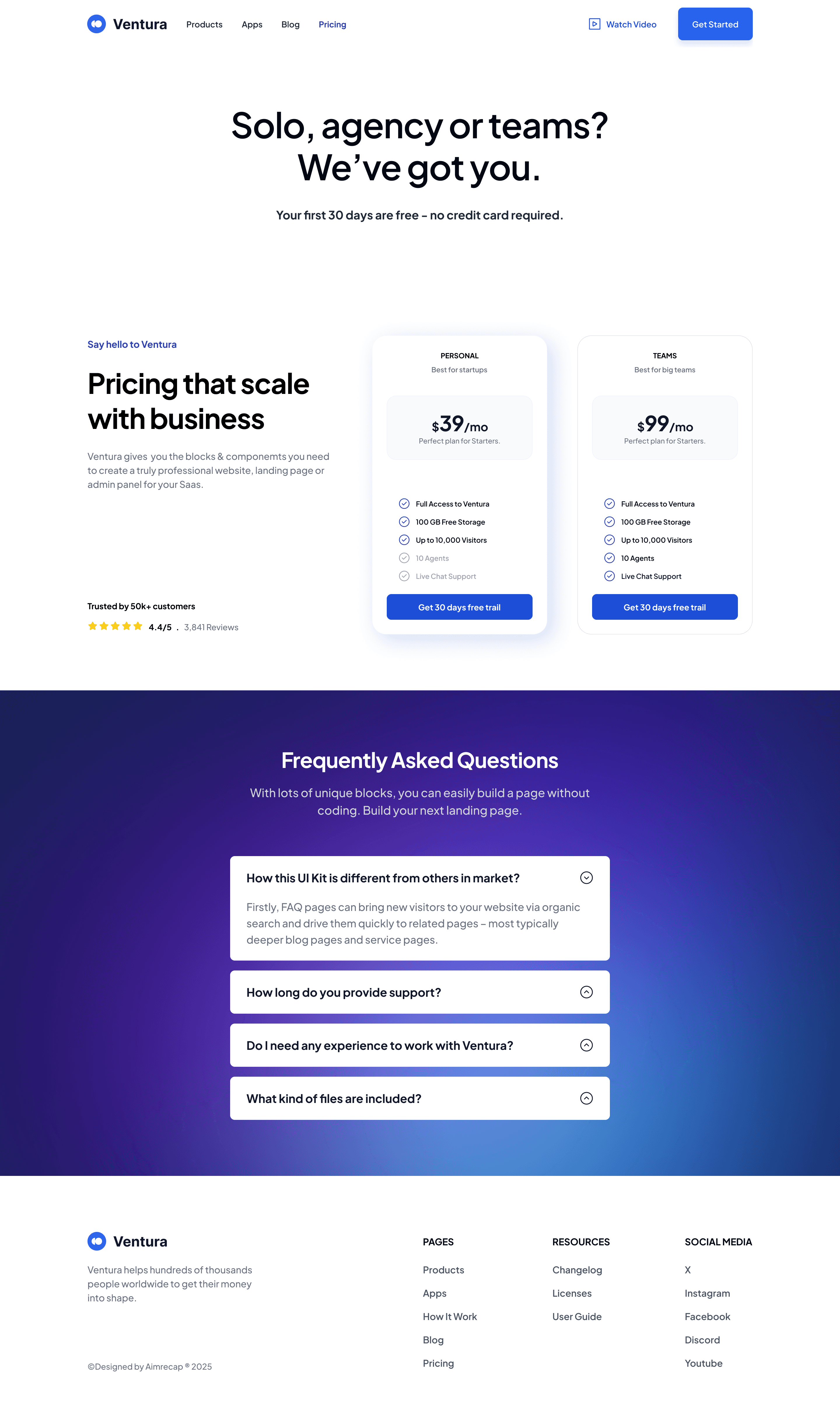
Pricing Page
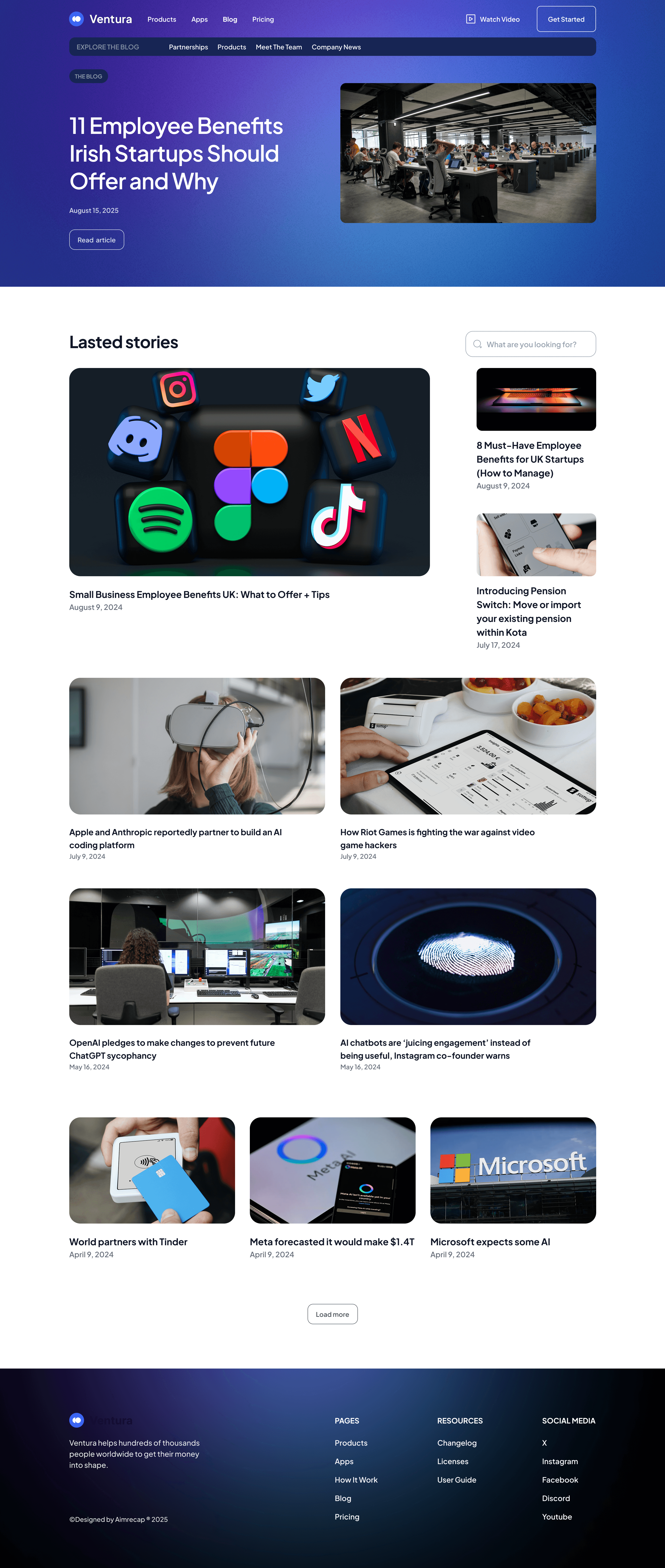
Ventura Blog Page

Mobile View

What I Learned

This project reinforced a critical lesson: brand personality must serve user goals, not compete with them. The initial vibrant gradients were beautiful and attention-grabbing, but when applied too liberally inside the dashboard, they competed with the data for the user's attention. I learned that my role isn't just to make things look beautiful, but to edit and restrain the brand where necessary to enhance functionality and trust.

I also learned the power of "progressive disclosure" in pricing. Initially, I wanted to pack every feature into the comparison cards. Through testing, I realized this overwhelmed users. The "Teams" plan needed to signal collaboration at a glance, not list every single permission setting. Moving detailed specs to a comparison table or tooltip reduced friction and improved click-through intent. The best design feels effortless because the hard decisions about what to leave out have already been made.

Mandela Arouna

Thanks!

Thanks so much for taking the time to view my portfolio.

Mandela Arouna

Thanks!

Thanks so much for taking the time to view my portfolio.

Mandela Arouna

Thanks!

Thanks so much for taking the time to view my portfolio.

Create a free website with Framer, the website builder loved by startups, designers and agencies.